
Upper Sandusky Community Library requested a “ground up” redesign of its web site.
According to the library, its website was technologically out of date, needed to be updated for easy access to information, and needed a welcoming theme. The library stakeholders wanted to keep the content on the current site and repurpose it. They also wanted the site to be easy to maintain. Here are the steps I followed to complete this very interesting IA challenge!
I wrote a project brief including all major components of the project
Step1: I defined the project components
a) Stakeholder needs:
· Ease of access to information
· Welcoming thematic elements
· Updated technology
· Better organization of content
· Improved ability for patrons to find the exact information they need
b) Solutions for the site’s IA problems:
· People: What patrons need do to, how they think and what they already know
· Content: What the site has, what it should have and what it needs
· Context: The business or personal goals for the site, who else will be involved and what the constraints are
c) Assessment of current site:
· home page
· organization scheme and structure
· labeling systems
· navigation systems
· searching systems
d) Schedule for the project
e) Recommendations:
· content inventory
· classification scheme
· site map
· navigation
· workflows
I performed research to understand municipal library patrons and the context of their library use
Step 2: I learned about people who use municipal libraries,
. Why they’re using the site (i.e., in what contexts are they using it)?
. What information are they are looking for or looking to enter?
To learn about users, I did field research and a literature review. Working independently, I interviewed two people at the Dayton Metro Library who had knowledge of online library patrons. I formulated user research questions by following best practices and brainstorming with my team. The themes of my questions were:
· Who are the users?
· What actions do they commonly perform on a municipal library site?
· Why do they perform these actions?
I conducted a literature search to find archival resources that helped me learn about the users of library websites. It was interesting and instructive to see the existing knowledge about library users.
I created a draft user research deliverable that included the following information:
· What I did to conduct my user research, including my research protocol
· What I learned about the typical users, including their most common tasks, and information they seek, and information they utilize in service of their goals.
· Primary and secondary personas I derived from my research.
· A table of the tasks the library’s site should support, organized by task priority (high, medium, low, or irrelevant) and persona. I described the tasks in short, understandable verb phrase that a user could understand such as “Find upcoming events being held at the library.”
4. Created final version incorporating feedback from my group.
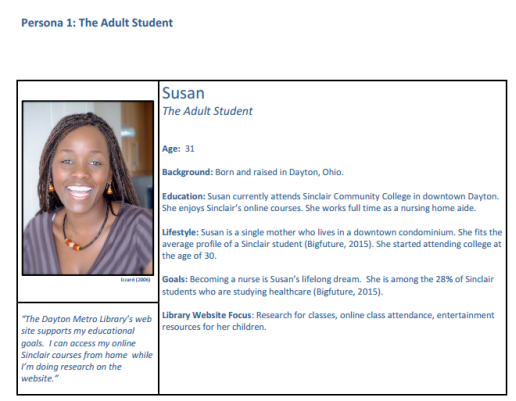
The three personas below represented the Upper Sandusky library patrons. These personas were used to guide the redesign. The first is Susan, a young single mother. Next is Larry, an unemployed homeless man. He hopes accessing resources through the library will lead to a better life. Finally, Gerald is a professor who is interested in genealogical research.


I identified content to be reworked, repurposed, or added
Step 3: My thought process about the library changed significantly when I saw the amount of usable content. I had assumed that most of the content was not actually good (although the stakeholder had said it was good). The problem was that the content was not visible. Much of the content could be reworked or repurposed. Some new content was also needed. I created a detailed content inventory to record my analysis. The excerpt below shows some of the items on the site.

I recommended a new primary classification scheme
Step 4: The current classification scheme of the library website was predominantly exact. But a better classification scheme was a hybrid, ambiguous scheme that supported access to various tasks, topics, and audience focused resources. The screen below shows the existing classification scheme.

I created a new site map
Step 5: The site map I recommended was suitable for the Upper Sandusky Community Library because it can accommodate a library of any size. This allowed the library website to expand, but still maintain its structure. The new site would be polyhierarchical, allowing a given item to appear in more than one location in the hierarchy. The site map below for the redesigned web site shows coordination with the content inventory.

I conducted Treejack and Chalkmark tests
Step 6: I used Treejack, the usability testing tool from Optimal Workshop, to test the existing architecture. Treejack tests whether or not a user can find information without the aid of visual directions. The Treejack test was conducted with nine tasks performed by seven participants. All of the participants completed all of the tasks; there were no abandonments or skipped tasks. The results indicated that participants had significant difficulty with the tree structure. Only 69% arrived at the correct answers. Furthermore, only 55% did so directly (without backtracking). I concluded that the labeling was misleading and/or confusing. The screen below shows an example of results for a task.

My thought process about the importance of labeling changed at this point. I had thought of it as very important, but not crucial. I now knew that inadequate labeling would cause a library site to fail in serving the needs of patrons.
Chalkmark is a tool that detects where users first click on a screen when they are performing a task. It uses wireframes rather than live web sites to track user clicks. It creates a “heatmap” of locations on the wireframe where the clicks occur. I created seven wireframes to represent the new hierarchy’s homepage and several secondary pages. I wrote seven test tasks. An example task was “You are an adult student using the library’s computer to write a paper. Get help using Microsoft Word.” Four participants completed the test. The results showed that patrons’ reactions ranged from 7 to 30 seconds before clicking. The responses were correct about 60% of the time. Again, I concluded that labeling is a feature that can make or break a web site.
The wireframe below shows a heatmap for the task “You have never used a library before. Find out how to use it.” One participant clicked “Using the Library” in the menu bar. The other three clicked “Get Started” in the body of the page.

I created a final assessment and recommendations
Step 7: Using the results of the content inventory, the redesigned site map, and the user testing, I created a final document including all assessment information and recommendations. The changes recommended for Upper Sandusky Community Library were planned using personas. This will ensure that the changes will serve the needs of all types of patrons.
Learning Results
Creating personas for this project impressed on me that there is truly a very broad range of patrons who use municipal libraries. Creating one web site to serve all their needs is a major task. I’m glad to have learned the right techniques and research methods.
See detailed documentation by accessing links below. Please contact me with any questions you have.


A story sketch appears below. I'm very glad to have completed this project. I think most library web sites in small towns are struggling with the same issues as Upper Sandusky Community Library. It's good that they are reaching out for help.
